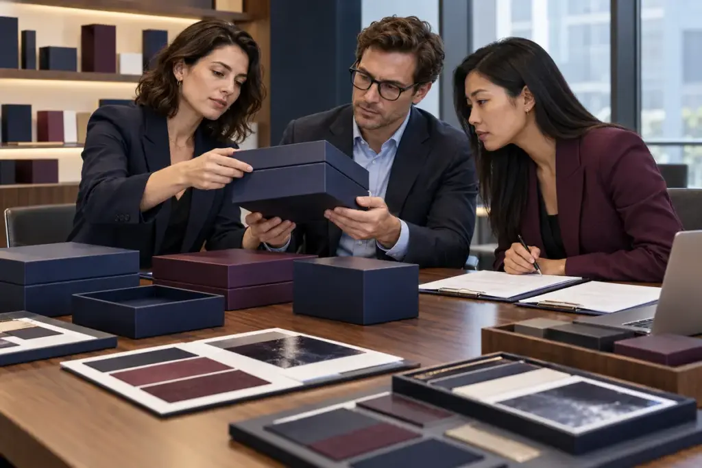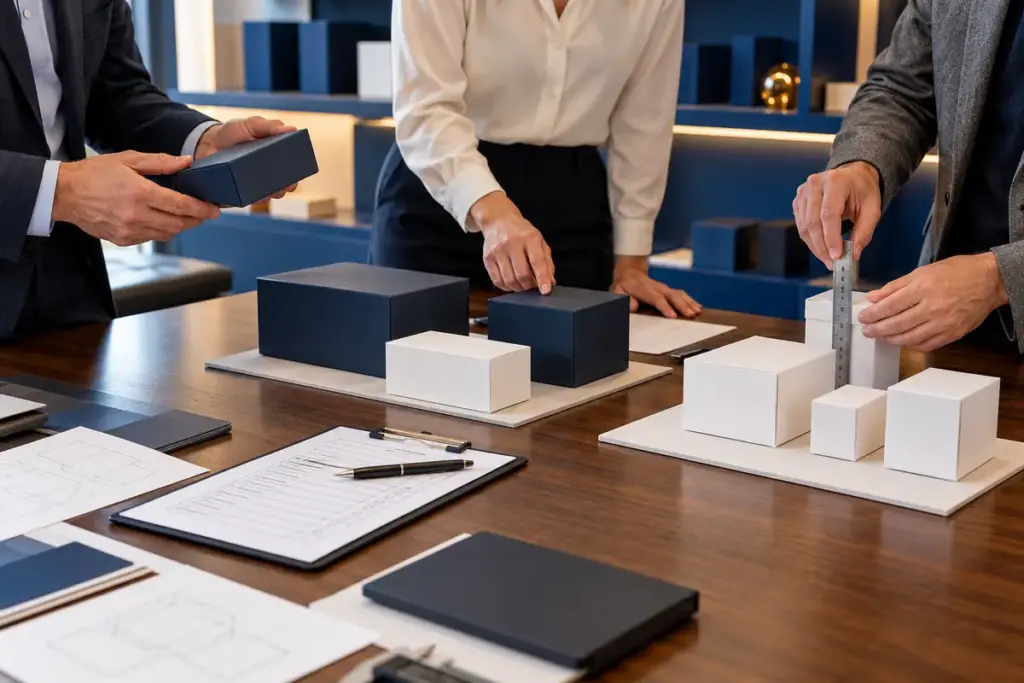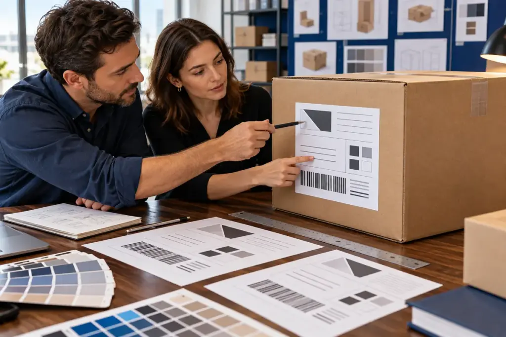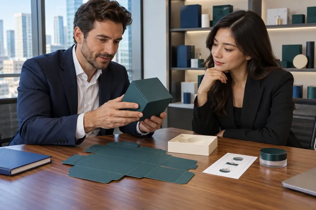
You may have already chosen the box structure, material and size. 그 다음에, just when the project seems ready for production, the packaging supplier replies: “Please send the editable AI or PDF artwork file.”
That is where many projects slow down.
Preparing 맞춤 포장 삽화 파일 correctly can prevent missing fonts, blurry logos, unexpected color changes, misplaced foil, incorrect dielines and repeated artwork revisions. 더 중요한 것은, a clean print-ready file helps the packaging factory move from design approval to sampling and mass production much faster.
그래서, before you send your final artwork, it is worth spending a few minutes checking the details that actually matter in production.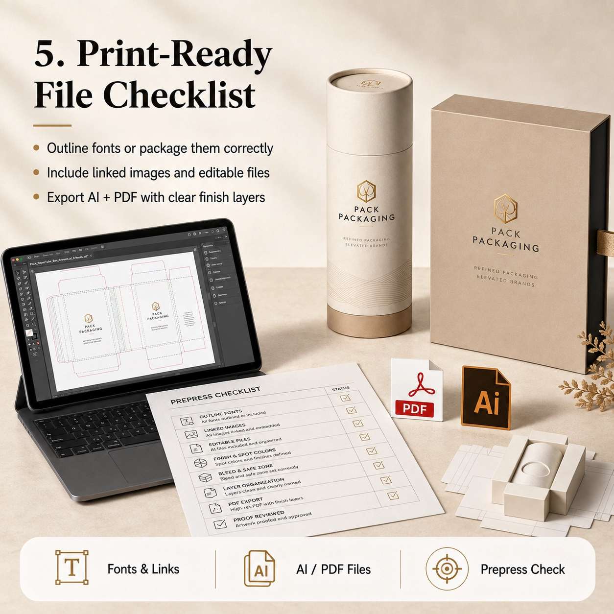
What Are Custom Packaging Artwork Files?
Custom packaging artwork files are the production-ready design files used to print and finish a custom paper box, 종이 튜브, 소매, carton or other package.
They are different from a simple JPG mockup.
A mockup shows what the packaging should look like. 하지만, a production artwork file tells the factory exactly where every element should be printed, 자르다, 접힌, stamped, embossed or coated.
A complete file may contain:
- Packaging dieline
- Cutting lines
- Creasing or folding lines
- Bleed area
- Safe area
- CMYK 아트웍
- 팬톤 컬러
- 심벌 마크
- 제품명
- 재료
- 바코드
- Regulatory information
- Hot-stamping layer
- Embossing layer
- Debossing layer
- Spot UV layer
- Window position
- Glue area
- Insert artwork
그런 이유로, packaging artwork should always be built on the final approved dieline rather than on an estimated rectangle.
Preferred File Formats
For most custom packaging projects, useful production formats include:
- Adobe Illustrator
.AI - Editable
.PDF .EPS
프로젝트에 따라, PSD or high-resolution image files may also be supplied for photographic elements.
하지만, vector files are generally more suitable for logos, 텍스트, cutting paths and special-finishing areas because they can be scaled without losing edge quality.
Why JPG and PNG Files Are Usually Not Enough
A JPG or PNG can be useful as a visual reference. 그럼에도 불구하고, it normally does not contain editable:
- Vector text
- 팬톤 컬러
- Dielines
- Foil layers
- Embossing paths
- Cutting information
그러므로, do not send only a screenshot and expect the factory to reproduce every detail accurately.
If editable artwork is unavailable, tell the supplier early. The design team can then confirm whether artwork reconstruction is required before sampling.
Why Artwork Preparation Matters
좋은 맞춤 포장 삽화 파일 do more than improve print quality.
They can also reduce:
- Artwork revisions
- Sample corrections
- Production delays
- Color misunderstandings
- Incorrect foil positions
- Missing information
- Reprinting risk
솔직히, many packaging delays happen before the machine even starts.
A bottle may already be approved. The packaging dimensions may already be confirmed. Yet production still cannot begin because the logo is missing, fonts are unavailable or the foil layer has not been separated.
그러므로, good artwork preparation is part of production planning, not merely graphic design.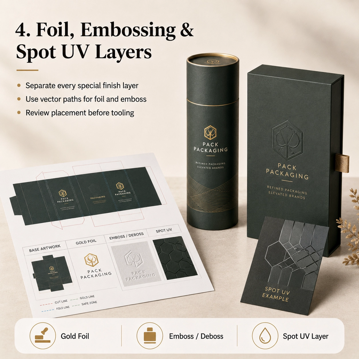
Start With the Correct Packaging Dieline
Before placing graphics, make sure you are working on the final dieline supplied or approved by the packaging manufacturer.
A dieline is the flat technical drawing of the package before it is folded or formed.
It may show:
- Cut lines
- Fold lines
- Glue areas
- Lid areas
- Bottom areas
- Seams
- 윈도우
- Insert positions
- Overlap sections
Never assume that two boxes of the same outer size use the same dieline.
예를 들어, a straight tuck-end carton, magnetic rigid box and drawer box may all measure 100 × 100 × 50 mm externally, yet their artwork layouts are completely different.
The same principle applies to cylindrical packaging.
A paper tube requires the designer to consider:
- Circumference
- 수직 솔기
- 뚜껑이 겹쳐짐
- Bottom section
- Inner neck
- Visible front area
그러므로, structural approval should happen before final artwork approval.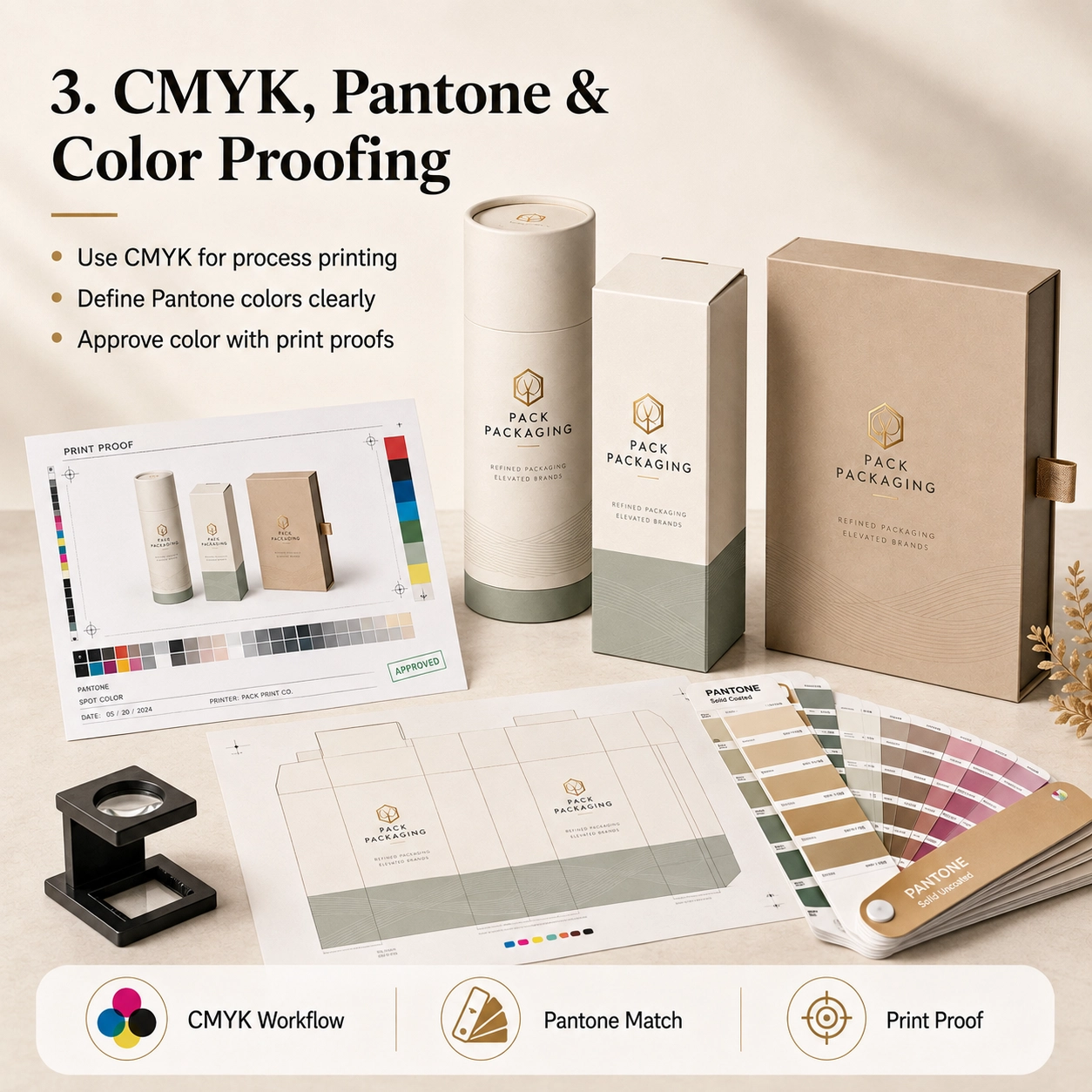
Understand Cut Lines, Fold Lines and Safe Areas
A packaging dieline usually contains several technical lines.
These should remain separate from the printed artwork.
Cut Line
The cut line shows where the packaging will be trimmed.
Do not place important text directly on this line.
Fold or Crease Line
Fold lines indicate where cartons will bend or where rigid-box components meet.
Avoid placing critical text directly across a fold unless the design intentionally requires it.
Bleed Area
Artwork that reaches the edge of a package should extend beyond the trim line into the bleed area.
Adobe’s Illustrator workflow supports setting bleed areas and printer’s marks for print production.
에이 3 mm bleed is common in many printing workflows, but the final requirement should always follow the factory’s dieline.
다시 말해서, do not assume every packaging project uses exactly the same bleed.
Safe Area
로고, small text, barcodes and important information should remain safely inside the trim edge.
The exact safe distance depends on:
- 구조
- Cutting tolerance
- 접는
- Tube seam
- Window position
- 마무리 손질
그러므로, follow the safe zone shown on the production dieline whenever one is provided.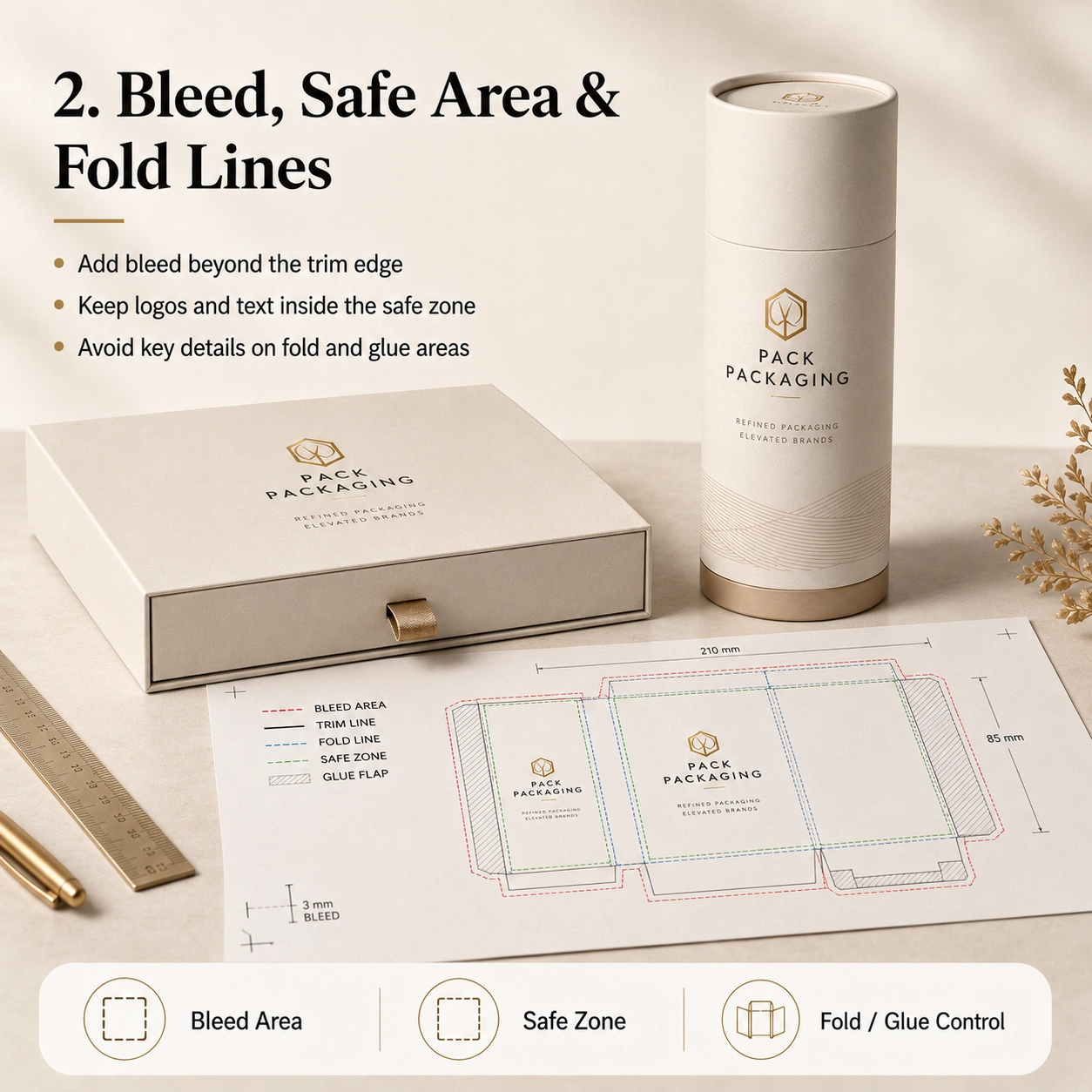
일반적인 응용
The preparation of 맞춤 포장 삽화 파일 changes slightly depending on what the packaging will hold.
향수 포장
Perfume packaging often contains relatively simple front graphics but more complex finishing.
A premium fragrance package may require separate artwork layers for:
- Main CMYK or Pantone print
- 금박
- Embossed logo
- 스팟 UV
- Inner neck color
- Insert branding
예를 들어, if the gold logo also needs to be embossed, the factory must understand whether the embossing follows the exact foil shape or covers a larger area.
그러므로, clearly label each layer.
Useful layer names include:
- GOLD FOIL
- EMBOSS
- CUT LINE
- CREASE LINE
- INSERT
That may sound basic, but it can prevent a surprising number of misunderstandings.
스킨케어 및 화장품
Skincare packaging usually contains more text.
여기에는 다음이 포함될 수 있습니다.:
- 제품명
- 재료
- 지도
- Net contents
- 경고
- Manufacturer information
- Batch area
- 바코드
결과적으로, text size and spacing become especially important.
Before sending the file, zoom in and check whether any important information sits too close to a fold, glue flap or edge.
차와 커피
Tea and coffee packaging often combines branding with:
- Product origin
- 재료
- 양조 지침
- Flavor notes
- Weight
- 바코드
- Food information
If the product uses kraft paper, remember that the natural brown paper will influence the appearance of printed colors.
그러므로, the same CMYK artwork can look different on white art paper and natural kraft.
초콜릿과 사탕
Chocolate and confectionery packaging may use colorful illustrations, photographs and metallic finishing.
게다가, food packaging can contain considerable mandatory text.
When a window is included, the artwork must also account for the exact visible opening.
Do not place important text too close to the window die line.
양초
Candle packaging often uses restrained artwork.
예를 들어:
- Brand logo
- Scent name
- Botanical illustration
- 제품 무게
- Safety information
A dark matte background with a small foil logo can look sophisticated.
하지만, dark areas also make scratches, registration errors and uneven edges more noticeable.
그러므로, physical sampling becomes particularly valuable.
Gift Products
Gift packaging allows more design freedom.
그럼에도 불구하고, the structure may be more complicated.
Magnetic boxes, 서랍 상자, sleeves and telescopic packaging all have multiple visible surfaces.
그러므로, the artwork should consider the customer’s opening sequence rather than only the closed front view.
재료 옵션
Paper selection affects how 맞춤 포장 삽화 파일 should be prepared and how the printed design will finally appear.
크래프트 종이
Natural kraft has its own brown base color.
따라서, printed colors can appear darker and less saturated than they do on a white computer screen.
For a clean kraft design, 고려하다:
- 검정색 인쇄
- 암록색
- Brown
- Simple Pantone colors
- White ink where supported
- 금 또는 구리 포일
The natural paper itself can become part of the design.
아트지
Coated art paper provides a smoother, whiter printing surface.
그러므로, it works well for:
- CMYK
- 사진술
- 그라데이션
- 정교한 타이포그래피
- 상세한 일러스트레이션
- 팬톤 컬러
인쇄 후, it can also receive matte, 광택, 부드러운 터치 또는 긁힘 방지 라미네이션.
특수지
Specialty papers may include:
- Linen texture
- Leather texture
- Pearl finish
- Metallic surface
- Dyed-through color
- Embossed texture
하지만, deep texture can affect small typography and fine foil details.
그러므로, the artwork may need to be simplified.
A logo with extremely thin lines may look beautiful on screen but reproduce poorly on a strongly textured paper.
Food-Grade Paper
Food-related packaging may use specific internal papers, coatings or liners.
The decorative artwork normally remains on the outside. 그 동안에, the food-contact materials are selected according to the application.
그러므로, do not assume that the printed decorative layer itself provides food-contact protection.
Foil-Lined Structures
Paper tubes for tea, 커피, snacks or other food products may use an aluminum foil or multilayer inner liner.
대개, the artwork file controls the exterior design, while the liner is defined in the material specification.
하지만, if the package includes a printed inner surface, confirm whether a separate inner artwork file is required.
구조 옵션
Different packaging structures need different artwork logic.
Standard Paper Tube
A paper tube artwork normally includes:
- Main body
- Vertical seam allowance
- Lid
- Bottom section
The designer should identify the primary viewing area and avoid placing the main logo directly on the seam.
어깨-목 튜브
Shoulder-neck tubes include an inner neck visible after opening.
This creates another branding opportunity.
예를 들어, the outside may be dark green while the inner neck uses gold or cream.
하지만, this visible inner component should be included in the approved material or artwork specification.
텔레스코픽 튜브
A telescopic tube contains a longer upper section and shorter base.
The artwork may need to align visually when the package is closed.
그러므로, carefully confirm:
- Lid height
- Base height
- Overlap
- Front orientation
Never design these areas using estimated dimensions.
윈도우 튜브
Window artwork requires an exact die-cut position.
The design should consider:
- Window shape
- 창 크기
- Window film
- Product position
- Text clearance
게다가, the product or inner pouch should remain aligned behind the opening.
Paper Tube With Insert
An insert may be:
- 에바
- EPE
- 판지
- 성형펄프
- 플라스틱 트레이
If the insert contains printed paper or a branded card, provide separate artwork for that component.
푸쉬업 튜브
Push-up packaging has functional moving areas.
그러므로, avoid placing critical text where the mechanism, seams or bottom movement may interfere with visibility.
트위스트 업 튜브
Twist-up structures require even more precise structural dimensions.
결과적으로, the dieline should be approved before any final branding artwork is completed.
Sleeve Packaging
A sleeve may be one of the easiest ways to differentiate multiple SKUs.
예를 들어, five products can share the same inner structure while each uses a different printed sleeve.
This can simplify both production and inventory.
인쇄 & 마무리 옵션
이곳은 맞춤 포장 삽화 파일 often become more complicated.
Every special printing or finishing process should be clearly separated.
CMYK 인쇄
CMYK is the standard process-color approach for many printed packaging applications.
Adobe recommends CMYK color mode for documents prepared for process-ink printing.
CMYK가 적합합니다.:
- 사진
- 그라데이션
- 일러스트레이션
- Multi-color graphics
If the design was originally created in RGB, colors may change when converted for print.
그러므로, do not approve critical packaging colors based only on a phone or monitor.
팬톤 / Spot Colors
Pantone or other spot colors may be useful when a brand needs a specific signature color.
예를 들어:
- Brand green
- Luxury burgundy
- Specific navy
- Corporate orange
Clearly identify the required spot color rather than supplying only an approximate RGB reference.
그럼에도 불구하고, paper type and surface finishing can still affect the final visual result.
그러므로, physical color samples may be appropriate for strict brand requirements.
핫 스탬핑
Hot-stamping artwork should normally be provided as a separate vector layer.
Avoid sending a rasterized gold gradient and expecting it to become metallic foil.
대신에, create a clearly labeled vector area such as:
GOLD FOIL
The foil artwork should generally use clean shapes and paths.
비슷하게, ask the supplier to review extremely fine details before tooling.
엠보싱
Embossing raises the paper surface.
그러므로, provide a separate layer showing exactly which areas should be raised.
예를 들어:
EMBOSS
If foil and embossing need to align, make that requirement explicit.
디보싱
Debossing presses the design inward.
Like embossing, it requires clear vector artwork and separate identification.
스팟 UV
Spot UV creates glossy contrast over selected areas.
Provide a dedicated layer, ~와 같은:
SPOT UV
Do not merge it into the main CMYK image.
그렇지 않으면, the printer may not know which graphic element needs the coating.
무광택 라미네이션
Matte lamination usually covers the full printed surface.
그러므로, it may not require a separate artwork layer.
대신에, specify it in the order or finishing instructions.
광택 라미네이션
Gloss lamination works in a similar way.
하지만, if only selected areas should be glossy, the project may actually require spot UV rather than full gloss lamination.
소프트 터치 라미네이션
Soft-touch film also normally covers the entire surface.
Because the film changes the appearance and tactile feel of printed colors, physical samples are valuable for premium packaging.
How to Prepare Print-Ready Custom Packaging Artwork Files
Before sending 맞춤 포장 삽화 파일 to the factory, go through the following checklist.
1. Use the Final Approved Dieline
Do not build production artwork on an old sample or early structural version.
If the box dimensions change, request the updated dieline.
2. Do Not Resize the Dieline
Packaging dielines are normally supplied at actual production scale.
그러므로, do not stretch, crop or proportionally resize them unless the supplier specifically instructs you to do so.
3. Add the Required Bleed
Background colors, photographs and graphics that reach the trim edge should extend into the bleed area.
Again, use the bleed specified by the packaging supplier.
4. Keep Important Elements Inside the Safe Zone
Keep:
- 로고
- Small text
- 바코드
- 제품명
- Regulatory information
away from cutting and folding tolerances.
5. Use CMYK for Process Printing
If the project will use four-color process printing, prepare the artwork for the correct print color workflow.
Adobe specifically identifies CMYK as the appropriate color mode for process-ink printing.
6. Identify Pantone Colors Clearly
Do not write only:
“Please match this green.”
대신에, provide the correct color reference when one is required.
7. Convert Fonts to Outlines or Package Them Correctly
Missing fonts can change the entire layout.
Adobe Illustrator supports converting type to outlines through Type > Create Outlines. Once converted, the type becomes paths and is no longer editable as normal text.
그러므로, keep an editable backup before outlining.
Another option is to package the file with the required fonts, subject to font licensing and supplier workflow.
8. Check Linked Images
A very common problem occurs when the AI file opens correctly on the designer’s computer but images disappear when the supplier opens it.
Why?
The images were linked but not included.
Adobe’s Illustrator Package function can collect the Illustrator document, linked graphics and supported fonts for file handoff.
그러므로, either:
- Package the complete job correctly, 또는
- Embed appropriate linked artwork
before delivery.
9. Use Suitable Image Quality
Do not enlarge a small web image until it looks blurry.
대신에, provide production-quality original artwork at the size required for print.
For photographs, check the effective resolution at final placed size.
10. Keep Logos as Vector Artwork
가능할 때마다, logos should remain vector.
This provides cleaner:
- 인쇄
- Foil edges
- 엠보싱
- Small text
- Scaling
11. Separate Special Finishing Layers
Recommended layer structure might look like:
- DIELINE
- CMYK PRINT
- PANTONE
- GOLD FOIL
- EMBOSS
- DEBOSS
- SPOT UV
- WINDOW
This makes production intent much clearer.
12. Do Not Delete the Technical Dieline
Keep the dieline available for production review.
하지만, it should remain on its own layer and should not accidentally print as part of the customer-facing design.
13. Check Overprint Settings
Unexpected overprint settings can cause certain objects to disappear or print incorrectly.
그러므로, overprint should be checked during prepress, particularly for complex spot-color or finishing files.
Adobe provides dedicated overprint and print-separation tools for reviewing this behavior.
14. Export a Print-Ready PDF
Along with the editable AI file, providing a PDF reference is extremely useful.
The PDF shows the intended final layout and gives the factory something to compare against.
15. Include a Visual Mockup
A 3D mockup is not a production file.
하지만, it is extremely helpful as a visual reference.
It tells the prepress team:
- Which side is the front
- How the package should close
- Which logo is most important
- How the finished structure should look
그러므로, the strongest file handoff often includes both technical artwork and a visual reference.
Packaging Artwork Preflight Checklist
Before clicking “Send,” check:
- Correct dieline version
- Correct package dimensions
- Bleed included
- Safe area checked
- CMYK artwork prepared
- Pantone colors identified
- Fonts outlined or correctly supplied
- Linked images included or embedded
- Logos are vector where possible
- Image quality checked
- Barcode checked
- Product text proofread
- Foil layer separated
- Embossing layer separated
- Debossing layer separated
- Spot UV layer separated
- Window layer confirmed
- Dieline remains separate
- PDF reference exported
- 3D mockup included
- Final artwork approved internally
Adobe Acrobat’s Preflight tools can also analyze PDF files for print-production conditions before output.
How Artwork Files Affect Packaging Production Time
Poorly prepared artwork can directly delay sampling and production.
예를 들어, imagine the following sequence:
- The supplier receives a JPG.
- Editable artwork is requested.
- The designer sends AI.
- Several linked images are missing.
- The files are resent.
- The dieline is outdated.
- The artwork is rebuilt.
- The foil layer is not separated.
- Another revision is required.
Suddenly, several days have disappeared before printing even begins.
대조적으로, properly prepared 맞춤 포장 삽화 파일 allow the prepress team to check the design, confirm manufacturing feasibility and move toward sampling more efficiently.
Planning a Product Launch?
Artwork preparation is only one part of the complete production schedule.
If you are also planning sampling, mass production and delivery, 우리의 글을 읽어보세요 Custom Paper Tube Production Time: Complete Lead Time Guide.
That guide explains how:
- 작품 승인
- 견본 추출
- MOQ
- 자재 가용성
- 인서트
- Special finishing
- Multiple SKUs
can affect the complete packaging timeline.
함께, these two guides answer two practical questions:
Is my artwork ready for printing?
그리고
How long will my packaging take once the artwork is approved?
Common Artwork Mistakes That Delay Production
Sending Only a Screenshot
A screenshot cannot usually provide the editable layers required for production.
대신에, provide editable artwork plus a PDF reference.
Using RGB Colors for Critical Print Matching
Colors that look bright on a monitor may not reproduce identically in process printing.
그러므로, prepare the correct print workflow and approve important colors realistically.
Missing Fonts
If a supplier does not have the font used in the artwork, text may change or disappear.
Outline fonts or supply them through an appropriate packaged workflow.
Missing Linked Images
This is one of the easiest problems to avoid.
Check the Illustrator Links panel before delivery. Adobe’s Links panel tracks whether placed artwork is linked or embedded.
Using a Low-Resolution Logo
A small web logo may look acceptable on a screen but poor in print.
Ask the brand team for the original vector logo.
Putting All Finishes on One Layer
If foil, embossing and UV are merged into the main artwork, the production team may need to rebuild the file.
그러므로, separate them from the start.
Changing the Dieline After Design Approval
Structure should come first.
If the dimensions change after artwork approval, the layout may need to be redesigned.
Designing Across Hidden Areas
Some parts of packaging disappear beneath:
- 뚜껑이 겹쳐짐
- Glue areas
- Tube seams
- Inner folds
그러므로, always study the assembled structure before positioning important branding.
규정 준수 & 지속 가능성
Artwork is not only about aesthetics.
Depending on the product and destination market, the final packaging may need to display specific information.
음식, cosmetics and other regulated products may require items such as:
- 제품명
- Net contents
- 재료
- 경고
- Manufacturer details
- Lot or batch areas
- Recycling information
- 바코드
- Market-specific symbols
The brand or importer should confirm exactly which regulatory statements are required for the final market.
그 동안에, the packaging manufacturer can help ensure the provided text fits the approved structure.
FSC
If FSC claims or marks are intended for packaging, their use should match the applicable certified material, chain-of-custody status and approval requirements.
그러므로, do not simply copy an FSC logo from the internet into the artwork.
식품 접촉 안전
Food-contact safety comes from the approved material construction rather than from the graphics alone.
프로젝트에 따라, relevant support may include:
- Food-contact reports
- 물질 선언
- 마이그레이션 보고서
- Ink information
- Adhesive information
BRC와 IFS
BRCGS or IFS-related supplier documentation may support packaging quality or food-industry procurement requirements.
하지만, these should not be presented as decorative product logos unless their use is appropriate and permitted.
EUDR과 EPR
For applicable European projects, brands may also need to consider relevant material due diligence, packaging EPR requirements and market-specific packaging information.
따라서, the artwork approval process should include the brand’s regulatory or compliance team when necessary.
Sustainable Design
Artwork itself can also influence material use.
예를 들어, a premium design does not always require:
- Full plastic lamination
- Large metallic foil areas
- Multiple decorative layers
- Oversized boxes
대신에, strong typography, thoughtful color and paper texture can create a premium presentation with fewer decorative processes.
사용자 정의 방법
Preparing 맞춤 포장 삽화 파일 becomes much easier when the packaging project follows the correct order.
단계 1: 제품 정보 보내기
제공하다:
- 제품 유형
- 제품 치수
- 제품 무게
- 제품 사진
- Physical sample when possible
단계 2: Confirm the Packaging Structure
선택하다:
- Paper tube
- Rigid box
- Folding carton
- Drawer box
- 소매
- Magnetic box
- Window structure
- 텔레스코픽 구조
단계 3: Confirm the Final Size
Do not finalize artwork before dimensions are approved.
단계 4: Choose the Materials
Select:
- 크라프트지
- 아트지
- 특수지
- Food-grade material
- 호일 라이너
단계 5: 삽입 확인
선택하다:
- 삽입 없음
- 판지
- 에바
- EPE
- 성형펄프
- 플라스틱 트레이
단계 6: Confirm Printing
Specify:
- CMYK
- 팬톤
- 단색 인쇄
- Mixed printing
단계 7: Confirm Finishing
Select:
- 핫 스탬핑
- 엠보싱
- 디보싱
- 스팟 UV
- 무광택 라미네이션
- 광택 라미네이션
- 소프트 터치 라미네이션
- 긁힘 방지 라미네이션
단계 8: Request the Final Dieline
Only after the structure and dimensions are confirmed should the final artwork be placed.
단계 9: 작품 준비
Use editable AI, PDF 또는 EPS 파일.
게다가, clearly separate special finishes.
단계 10: MOQ 확인
Tell the supplier your realistic order quantity.
예를 들어:
- 500 PC
- 1,000 PC
- 3,000 PC
- 5,000 PC
- 10,000 PC
단계 11: 리드타임 확인
공유하다:
- Launch date
- Required factory completion date
- 배송지
단계 12: 샘플 승인
Check:
- 구조
- 크기
- 삽화
- 색상
- 박
- 엠보싱
- 삽입 맞춤
- Product positioning
Only after approval should mass production begin.
관련 제품: 맞춤형 종이 튜브 / 식품 포장 / 화장품 포장
팩 포장을 선택하는 이유?
Pack Packaging supports custom paper tubes and paper boxes from structural development through printing and mass production.
우리의 제조 시설은 다음과 같습니다 20,000㎡, 포함 2,000㎡ 식품 등급 워크샵. 게다가, 월간 종이 튜브 용량 초과 10,000,000 조각들.
우리의 20+ 멤버 디자인팀 도움을 줄 수 있다:
- Structural dielines
- Product fitting
- 작품 레이아웃
- File checking
- 재료 선택
- 인서트 개발
- 인쇄
- 핫 스탬핑
- 엠보싱
- 스팟 UV
- 견본 추출
- 생산 최적화
When buyers send 맞춤 포장 삽화 파일, our team reviews the file against the actual packaging structure instead of checking the graphic design in isolation.
OEM 및 ODM 기능에는 다음이 포함됩니다.:
- Custom dimensions
- 종이 튜브
- 단단한 상자
- 접는 상자
- Drawer boxes
- 슬리브 박스
- 크라프트지
- 아트지
- 특수지
- Food-grade materials
- 판지 삽입물
- EVA 인서트
- EPE 인서트
- 성형 펄프 인서트
- CMYK 인쇄
- 팬톤 인쇄
- 핫 스탬핑
- 엠보싱
- 디보싱
- 스팟 UV
- 무광택 라미네이션
- 광택 라미네이션
- 소프트 터치 라미네이션
- 긁힘 방지 라미네이션
- 구조 샘플
- 인쇄된 샘플
- 품질검사
- 수출 포장
선택한 재료와 용도에 따라, supporting documentation may include FSC, 식품 접촉 보고서, BRC 관련 문서, IFS 관련 문서, RoHS 규제 2.0, REACH-SVHC 및 EPR 지원 정보.
The exact documentation should always be confirmed against the approved specification and target market.
자주 묻는 질문
1. Which artwork file format should I send for custom packaging?
편집 가능한 AI, PDF or EPS files are generally preferred. A PDF reference or 3D mockup can also help communicate how the finished package should look.
2. Should packaging artwork be CMYK or RGB?
For process printing, artwork should be prepared using an appropriate CMYK print workflow. Adobe also recommends CMYK for documents intended for process-ink printing.
3. Should I convert fonts to outlines?
Converting fonts to outlines can prevent missing-font problems. 하지만, keep a separate editable backup because outlined text can no longer be edited as normal type.
4. How much bleed should packaging artwork have?
Many print workflows use approximately 3 mm, but the correct bleed depends on the factory’s dieline and production process. 그러므로, always follow the bleed specified by your packaging supplier.
5. Do foil stamping and embossing need separate artwork?
예. 핫 스탬핑, 엠보싱, debossing and spot UV should normally be clearly identified as separate production layers or vector areas.
6. Can I send a Canva, JPG or PNG design?
These can be useful references, but a manufacturer may still need editable production artwork. Ask the prepress team what file format is required before sampling.
7. Why does my printed packaging color look different from my monitor?
Screens and printing use different color systems, while paper, 잉크, lamination and lighting also influence the final result. 그러므로, physical color approval is important when exact color matching matters.
8. Can your design team help prepare my artwork?
예. If you provide the logo, 텍스트, product information and design direction, the artwork can be reviewed or adjusted to fit the approved structure before sampling.
더 많은 맞춤형 포장 솔루션 살펴보기
더 많은 포장 옵션을 찾고 있습니다.? 다양한 산업 및 응용 분야에 맞게 설계된 맞춤형 포장 제품 전체를 살펴보세요..
접이식 상자 – 소매 포장을 위한 가볍고 완전히 맞춤화 가능한 상자.
단단한 상자 – 명품 브랜드를 위한 프리미엄 견고한 선물 상자.
골판지 상자 – 내구성 있는 배송 및 전자상거래 포장 솔루션.
어린이 방지 상자 – 규제 대상 제품의 안전한 포장.
부속품 – 맞춤형 인서트, 티슈 페이퍼, 고삐, 라벨, 그리고 더.
종이 튜브 – 차를 위한 맞춤형 종이 튜브 포장 전용 컬렉션을 살펴보세요., 커피, 화장품, 양초, 주정, 및 기타 프리미엄 제품을 전문 홈페이지에서 만나보실 수 있습니다..
맞춤형 포장이 필요합니다? 무료 견적과 전문가 상담을 받으려면 지금 저희 팀에 문의하세요..