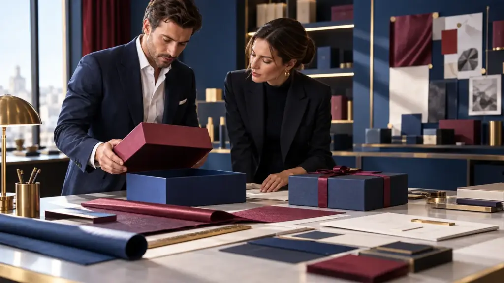
You may have already chosen the box structure, material and size. Poi, just when the project seems ready for production, the packaging supplier replies: “Please send the editable AI or PDF artwork file.”
That is where many projects slow down.
Preparing custom packaging artwork files correctly can prevent missing fonts, blurry logos, unexpected color changes, misplaced foil, incorrect dielines and repeated artwork revisions. Ancora più importante, a clean print-ready file helps the packaging factory move from design approval to sampling and mass production much faster.
COSÌ, before you send your final artwork, it is worth spending a few minutes checking the details that actually matter in production.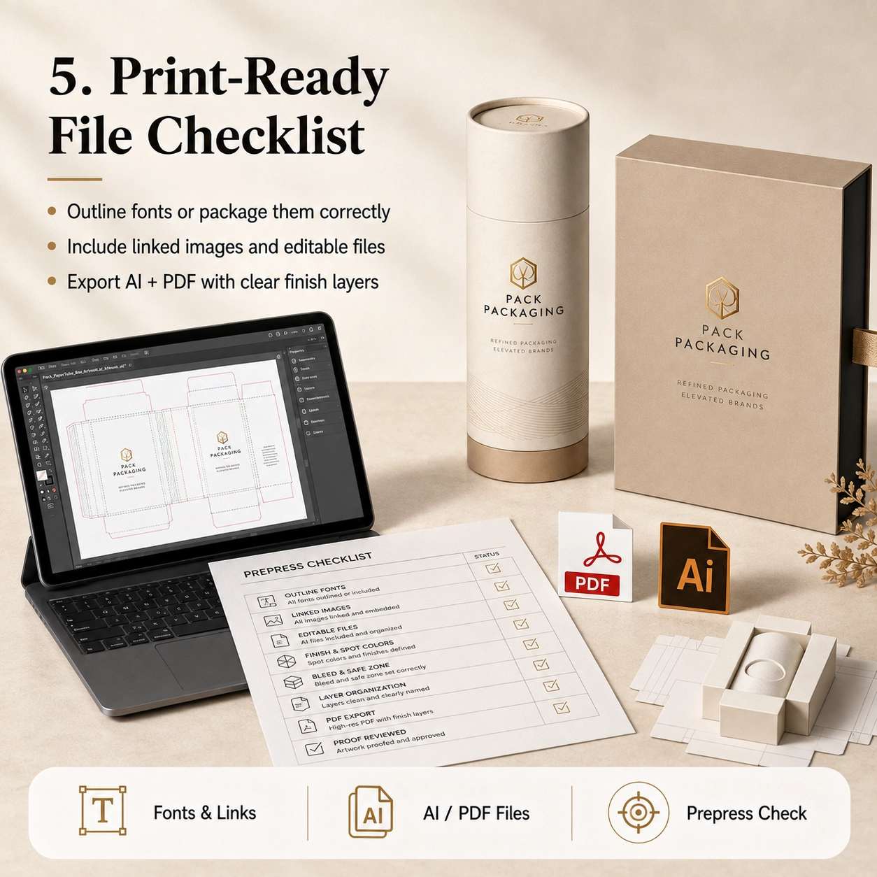
What Are Custom Packaging Artwork Files?
Custom packaging artwork files are the production-ready design files used to print and finish a custom paper box, tubo di carta, manica, carton or other package.
They are different from a simple JPG mockup.
A mockup shows what the packaging should look like. Tuttavia, a production artwork file tells the factory exactly where every element should be printed, taglio, piegato, stamped, embossed or coated.
A complete file may contain:
- Packaging dieline
- Cutting lines
- Creasing or folding lines
- Bleed area
- Safe area
- Grafica CMYK
- Colori Pantone
- Logo
- Nome del prodotto
- Ingredienti
- Codice a barre
- Regulatory information
- Hot-stamping layer
- Embossing layer
- Debossing layer
- Spot UV layer
- Posizione della finestra
- Glue area
- Insert artwork
Per questo motivo, packaging artwork should always be built on the final approved dieline rather than on an estimated rectangle.
Preferred File Formats
For most custom packaging projects, useful production formats include:
- Adobe Illustrator
.AI - Editable
.PDF .EPS
A seconda del progetto, PSD or high-resolution image files may also be supplied for photographic elements.
Tuttavia, vector files are generally more suitable for logos, testo, cutting paths and special-finishing areas because they can be scaled without losing edge quality.
Why JPG and PNG Files Are Usually Not Enough
A JPG or PNG can be useful as a visual reference. Tuttavia, it normally does not contain editable:
- Vector text
- Colori Pantone
- Dielines
- Foil layers
- Embossing paths
- Cutting information
Perciò, do not send only a screenshot and expect the factory to reproduce every detail accurately.
If editable artwork is unavailable, tell the supplier early. The design team can then confirm whether artwork reconstruction is required before sampling.
Why Artwork Preparation Matters
Bene custom packaging artwork files do more than improve print quality.
They can also reduce:
- Artwork revisions
- Sample corrections
- Production delays
- Color misunderstandings
- Incorrect foil positions
- Missing information
- Reprinting risk
Onestamente, many packaging delays happen before the machine even starts.
A bottle may already be approved. The packaging dimensions may already be confirmed. Yet production still cannot begin because the logo is missing, fonts are unavailable or the foil layer has not been separated.
Perciò, good artwork preparation is part of production planning, not merely graphic design.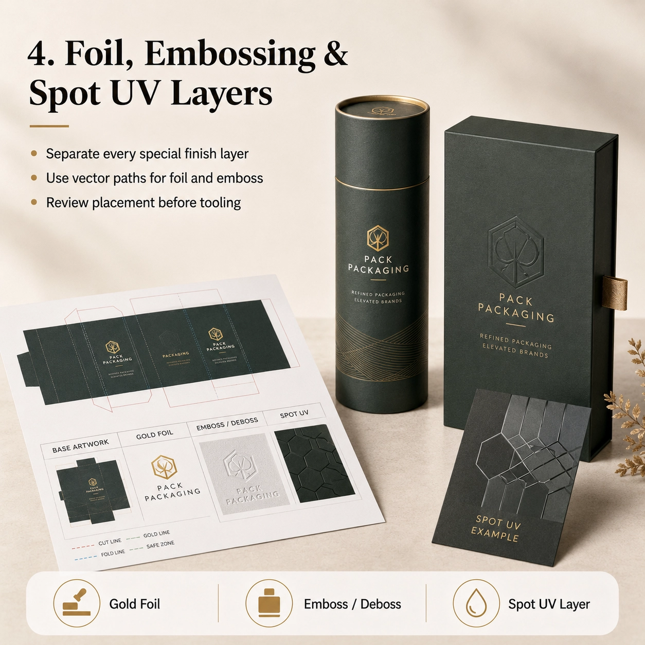
Start With the Correct Packaging Dieline
Before placing graphics, make sure you are working on the final dieline supplied or approved by the packaging manufacturer.
A dieline is the flat technical drawing of the package before it is folded or formed.
It may show:
- Cut lines
- Fold lines
- Glue areas
- Lid areas
- Bottom areas
- Seams
- Finestre
- Insert positions
- Overlap sections
Never assume that two boxes of the same outer size use the same dieline.
Per esempio, a straight tuck-end carton, magnetic rigid box and drawer box may all measure 100 × 100 × 50 mm externally, yet their artwork layouts are completely different.
The same principle applies to cylindrical packaging.
A paper tube requires the designer to consider:
- Circumference
- Cucitura verticale
- Sovrapposizione del coperchio
- Bottom section
- Inner neck
- Visible front area
Perciò, structural approval should happen before final artwork approval.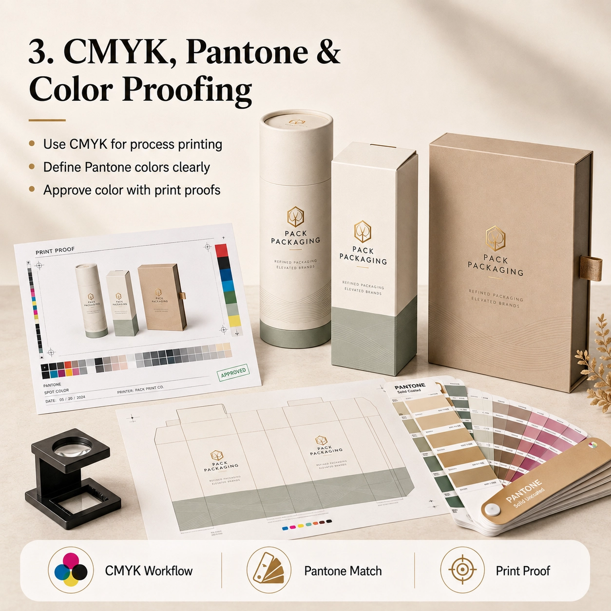
Understand Cut Lines, Fold Lines and Safe Areas
A packaging dieline usually contains several technical lines.
These should remain separate from the printed artwork.
Cut Line
The cut line shows where the packaging will be trimmed.
Do not place important text directly on this line.
Fold or Crease Line
Fold lines indicate where cartons will bend or where rigid-box components meet.
Avoid placing critical text directly across a fold unless the design intentionally requires it.
Bleed Area
Artwork that reaches the edge of a package should extend beyond the trim line into the bleed area.
Adobe’s Illustrator workflow supports setting bleed areas and printer’s marks for print production.
UN 3 mm bleed is common in many printing workflows, but the final requirement should always follow the factory’s dieline.
In altre parole, do not assume every packaging project uses exactly the same bleed.
Safe Area
Loghi, piccolo testo, barcodes and important information should remain safely inside the trim edge.
The exact safe distance depends on:
- Struttura
- Cutting tolerance
- Pieghevole
- Tube seam
- Posizione della finestra
- Finitura
Perciò, follow the safe zone shown on the production dieline whenever one is provided.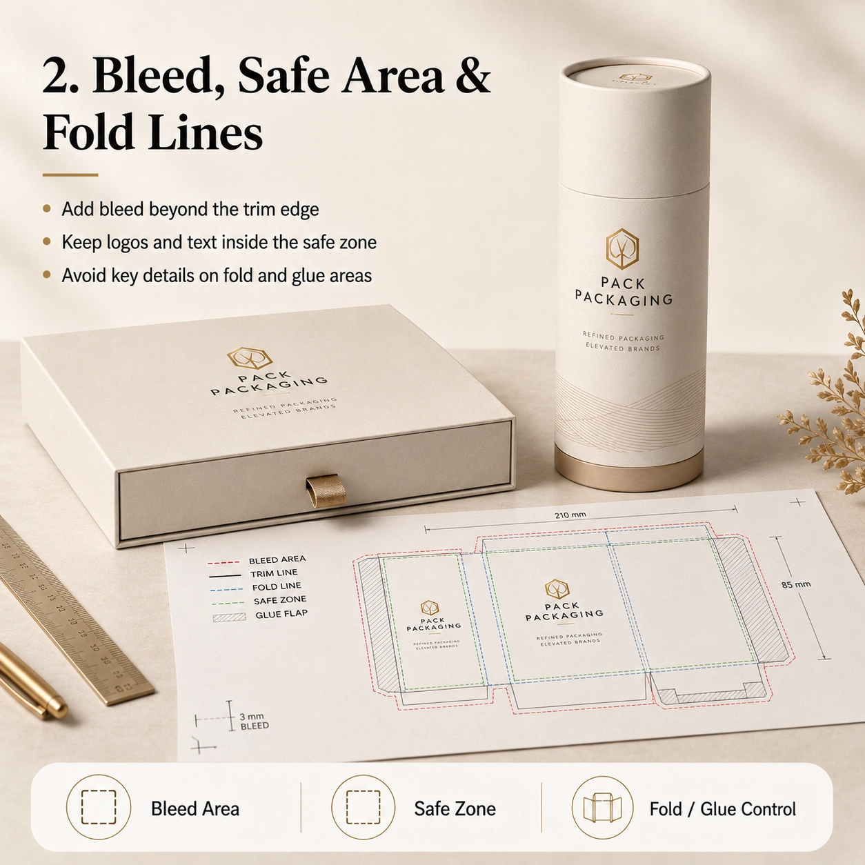
Applicazioni comuni
The preparation of custom packaging artwork files changes slightly depending on what the packaging will hold.
Confezione di profumi
Perfume packaging often contains relatively simple front graphics but more complex finishing.
A premium fragrance package may require separate artwork layers for:
- Main CMYK or Pantone print
- Lamina d'oro
- Embossed logo
- Spot UV
- Inner neck color
- Insert branding
Per esempio, if the gold logo also needs to be embossed, the factory must understand whether the embossing follows the exact foil shape or covers a larger area.
Perciò, clearly label each layer.
Useful layer names include:
- GOLD FOIL
- EMBOSS
- CUT LINE
- CREASE LINE
- INSERT
That may sound basic, but it can prevent a surprising number of misunderstandings.
Cura della pelle e cosmetici
Skincare packaging usually contains more text.
Ciò può includere:
- Nome del prodotto
- Ingredienti
- Directions
- Net contents
- Avvertenze
- Manufacturer information
- Batch area
- Codice a barre
Di conseguenza, text size and spacing become especially important.
Before sending the file, zoom in and check whether any important information sits too close to a fold, glue flap or edge.
Tè e caffè
Tea and coffee packaging often combines branding with:
- Product origin
- Ingredienti
- Istruzioni per la preparazione
- Flavor notes
- Peso
- Codice a barre
- Food information
If the product uses kraft paper, remember that the natural brown paper will influence the appearance of printed colors.
Perciò, the same CMYK artwork can look different on white art paper and natural kraft.
Cioccolato e Caramelle
Chocolate and confectionery packaging may use colorful illustrations, photographs and metallic finishing.
Inoltre, food packaging can contain considerable mandatory text.
When a window is included, the artwork must also account for the exact visible opening.
Do not place important text too close to the window die line.
Candele
Candle packaging often uses restrained artwork.
Per esempio:
- Brand logo
- Scent name
- Botanical illustration
- Peso del prodotto
- Safety information
A dark matte background with a small foil logo can look sophisticated.
Tuttavia, dark areas also make scratches, registration errors and uneven edges more noticeable.
Perciò, physical sampling becomes particularly valuable.
Gift Products
Gift packaging allows more design freedom.
Tuttavia, the structure may be more complicated.
Scatole magnetiche, cassettiere, sleeves and telescopic packaging all have multiple visible surfaces.
Perciò, the artwork should consider the customer’s opening sequence rather than only the closed front view.
Opzioni materiali
Paper selection affects how custom packaging artwork files should be prepared and how the printed design will finally appear.
Carta Kraft
Natural kraft has its own brown base color.
Di conseguenza, printed colors can appear darker and less saturated than they do on a white computer screen.
For a clean kraft design, considerare:
- Stampa nera
- Verde scuro
- Brown
- Simple Pantone colors
- White ink where supported
- Lamina d'oro o di rame
The natural paper itself can become part of the design.
Carta d'arte
Coated art paper provides a smoother, whiter printing surface.
Perciò, it works well for:
- CMYK
- Fotografia
- Gradienti
- Tipografia raffinata
- Illustrazioni dettagliate
- Colori Pantone
Dopo la stampa, it can also receive matte, lucentezza, laminazione soft-touch o antigraffio.
Carta speciale
Specialty papers may include:
- Trama di lino
- Leather texture
- Pearl finish
- Metallic surface
- Dyed-through color
- Embossed texture
Tuttavia, deep texture can affect small typography and fine foil details.
Perciò, the artwork may need to be simplified.
A logo with extremely thin lines may look beautiful on screen but reproduce poorly on a strongly textured paper.
Carta per alimenti
Food-related packaging may use specific internal papers, coatings or liners.
The decorative artwork normally remains on the outside. Nel frattempo, the food-contact materials are selected according to the application.
Perciò, do not assume that the printed decorative layer itself provides food-contact protection.
Foil-Lined Structures
Paper tubes for tea, caffè, snacks or other food products may use an aluminum foil or multilayer inner liner.
Generalmente, the artwork file controls the exterior design, while the liner is defined in the material specification.
Tuttavia, if the package includes a printed inner surface, confirm whether a separate inner artwork file is required.
Opzioni della struttura
Different packaging structures need different artwork logic.
Standard Paper Tube
A paper tube artwork normally includes:
- Main body
- Vertical seam allowance
- Coperchio
- Bottom section
The designer should identify the primary viewing area and avoid placing the main logo directly on the seam.
Tubolare spalla-collo
Shoulder-neck tubes include an inner neck visible after opening.
This creates another branding opportunity.
Ad esempio, the outside may be dark green while the inner neck uses gold or cream.
Tuttavia, this visible inner component should be included in the approved material or artwork specification.
Tubo telescopico
A telescopic tube contains a longer upper section and shorter base.
The artwork may need to align visually when the package is closed.
Perciò, carefully confirm:
- Lid height
- Base height
- Overlap
- Front orientation
Never design these areas using estimated dimensions.
Tubo per finestra
Window artwork requires an exact die-cut position.
The design should consider:
- Window shape
- Dimensione della finestra
- Pellicola per vetri
- Product position
- Text clearance
Inoltre, the product or inner pouch should remain aligned behind the opening.
Paper Tube With Insert
An insert may be:
- EVA
- EPE
- Cartone
- Polpa modellata
- Vassoio di plastica
If the insert contains printed paper or a branded card, provide separate artwork for that component.
Tubo push-up
Push-up packaging has functional moving areas.
Perciò, avoid placing critical text where the mechanism, seams or bottom movement may interfere with visibility.
Tubo attorcigliato
Twist-up structures require even more precise structural dimensions.
Di conseguenza, the dieline should be approved before any final branding artwork is completed.
Sleeve Packaging
A sleeve may be one of the easiest ways to differentiate multiple SKUs.
Per esempio, five products can share the same inner structure while each uses a different printed sleeve.
This can simplify both production and inventory.
Stampa & Opzioni di finitura
This is where custom packaging artwork files often become more complicated.
Every special printing or finishing process should be clearly separated.
Stampa CMYK
CMYK is the standard process-color approach for many printed packaging applications.
Adobe recommends CMYK color mode for documents prepared for process-ink printing.
CMYK è adatto per:
- Fotografie
- Gradienti
- Illustrazioni
- Grafica multicolore
If the design was originally created in RGB, colors may change when converted for print.
Perciò, do not approve critical packaging colors based only on a phone or monitor.
Pantone / Spot Colors
Pantone or other spot colors may be useful when a brand needs a specific signature color.
Per esempio:
- Brand green
- Luxury burgundy
- Specific navy
- Corporate orange
Clearly identify the required spot color rather than supplying only an approximate RGB reference.
Tuttavia, paper type and surface finishing can still affect the final visual result.
Perciò, physical color samples may be appropriate for strict brand requirements.
Stampa a caldo
Hot-stamping artwork should normally be provided as a separate vector layer.
Avoid sending a rasterized gold gradient and expecting it to become metallic foil.
Invece, create a clearly labeled vector area such as:
GOLD FOIL
The foil artwork should generally use clean shapes and paths.
Allo stesso modo, ask the supplier to review extremely fine details before tooling.
Goffratura
La goffratura solleva la superficie della carta.
Perciò, provide a separate layer showing exactly which areas should be raised.
Per esempio:
EMBOSS
If foil and embossing need to align, make that requirement explicit.
Incisione
Debossing presses the design inward.
Like embossing, it requires clear vector artwork and separate identification.
Spot UV
Spot UV creates glossy contrast over selected areas.
Provide a dedicated layer, ad esempio:
SPOT UV
Do not merge it into the main CMYK image.
Altrimenti, the printer may not know which graphic element needs the coating.
Laminazione opaca
Matte lamination usually covers the full printed surface.
Perciò, it may not require a separate artwork layer.
Invece, specify it in the order or finishing instructions.
Laminazione lucida
Gloss lamination works in a similar way.
Tuttavia, if only selected areas should be glossy, the project may actually require spot UV rather than full gloss lamination.
Laminazione morbida al tocco
Soft-touch film also normally covers the entire surface.
Because the film changes the appearance and tactile feel of printed colors, physical samples are valuable for premium packaging.
How to Prepare Print-Ready Custom Packaging Artwork Files
Before sending custom packaging artwork files to the factory, go through the following checklist.
1. Use the Final Approved Dieline
Do not build production artwork on an old sample or early structural version.
If the box dimensions change, request the updated dieline.
2. Do Not Resize the Dieline
Packaging dielines are normally supplied at actual production scale.
Perciò, do not stretch, crop or proportionally resize them unless the supplier specifically instructs you to do so.
3. Add the Required Bleed
Background colors, photographs and graphics that reach the trim edge should extend into the bleed area.
Ancora, use the bleed specified by the packaging supplier.
4. Keep Important Elements Inside the Safe Zone
Keep:
- Loghi
- Small text
- Codici a barre
- Nomi dei prodotti
- Regulatory information
away from cutting and folding tolerances.
5. Use CMYK for Process Printing
If the project will use four-color process printing, prepare the artwork for the correct print color workflow.
Adobe specifically identifies CMYK as the appropriate color mode for process-ink printing.
6. Identify Pantone Colors Clearly
Do not write only:
“Please match this green.”
Invece, provide the correct color reference when one is required.
7. Convert Fonts to Outlines or Package Them Correctly
Missing fonts can change the entire layout.
Adobe Illustrator supports converting type to outlines through Type > Create Outlines. Once converted, the type becomes paths and is no longer editable as normal text.
Perciò, keep an editable backup before outlining.
Another option is to package the file with the required fonts, subject to font licensing and supplier workflow.
8. Check Linked Images
A very common problem occurs when the AI file opens correctly on the designer’s computer but images disappear when the supplier opens it.
Why?
The images were linked but not included.
Adobe’s Illustrator Package function can collect the Illustrator document, linked graphics and supported fonts for file handoff.
Perciò, either:
- Package the complete job correctly, O
- Embed appropriate linked artwork
before delivery.
9. Use Suitable Image Quality
Do not enlarge a small web image until it looks blurry.
Invece, provide production-quality original artwork at the size required for print.
For photographs, check the effective resolution at final placed size.
10. Keep Logos as Vector Artwork
Quando possibile, logos should remain vector.
This provides cleaner:
- Stampa
- Foil edges
- Goffratura
- Small text
- Scaling
11. Separate Special Finishing Layers
Recommended layer structure might look like:
- DIELINE
- CMYK PRINT
- PANTONE
- GOLD FOIL
- EMBOSS
- DEBOSS
- SPOT UV
- WINDOW
This makes production intent much clearer.
12. Do Not Delete the Technical Dieline
Keep the dieline available for production review.
Tuttavia, it should remain on its own layer and should not accidentally print as part of the customer-facing design.
13. Check Overprint Settings
Unexpected overprint settings can cause certain objects to disappear or print incorrectly.
Perciò, overprint should be checked during prepress, particularly for complex spot-color or finishing files.
Adobe provides dedicated overprint and print-separation tools for reviewing this behavior.
14. Export a Print-Ready PDF
Along with the editable AI file, providing a PDF reference is extremely useful.
The PDF shows the intended final layout and gives the factory something to compare against.
15. Include a Visual Mockup
A 3D mockup is not a production file.
Tuttavia, it is extremely helpful as a visual reference.
It tells the prepress team:
- Which side is the front
- How the package should close
- Which logo is most important
- How the finished structure should look
Perciò, the strongest file handoff often includes both technical artwork and a visual reference.
Packaging Artwork Preflight Checklist
Before clicking “Send,” check:
- Correct dieline version
- Correct package dimensions
- Bleed included
- Safe area checked
- CMYK artwork prepared
- Pantone colors identified
- Fonts outlined or correctly supplied
- Linked images included or embedded
- Logos are vector where possible
- Image quality checked
- Barcode checked
- Product text proofread
- Foil layer separated
- Embossing layer separated
- Debossing layer separated
- Spot UV layer separated
- Window layer confirmed
- Dieline remains separate
- PDF reference exported
- 3D mockup included
- Final artwork approved internally
Adobe Acrobat’s Preflight tools can also analyze PDF files for print-production conditions before output.
How Artwork Files Affect Packaging Production Time
Poorly prepared artwork can directly delay sampling and production.
Per esempio, imagine the following sequence:
- The supplier receives a JPG.
- Editable artwork is requested.
- The designer sends AI.
- Several linked images are missing.
- The files are resent.
- The dieline is outdated.
- The artwork is rebuilt.
- The foil layer is not separated.
- Another revision is required.
Suddenly, several days have disappeared before printing even begins.
Al contrario, properly prepared custom packaging artwork files allow the prepress team to check the design, confirm manufacturing feasibility and move toward sampling more efficiently.
Planning a Product Launch?
Artwork preparation is only one part of the complete production schedule.
If you are also planning sampling, mass production and delivery, leggi il nostro Custom Paper Tube Production Time: Complete Lead Time Guide.
That guide explains how:
- Approvazione dell'opera d'arte
- Campionamento
- MOQ
- Disponibilità materiale
- Inserti
- Special finishing
- Multiple SKUs
can affect the complete packaging timeline.
Insieme, these two guides answer two practical questions:
Is my artwork ready for printing?
E
How long will my packaging take once the artwork is approved?
Common Artwork Mistakes That Delay Production
Sending Only a Screenshot
A screenshot cannot usually provide the editable layers required for production.
Invece, provide editable artwork plus a PDF reference.
Using RGB Colors for Critical Print Matching
Colors that look bright on a monitor may not reproduce identically in process printing.
Perciò, prepare the correct print workflow and approve important colors realistically.
Missing Fonts
If a supplier does not have the font used in the artwork, text may change or disappear.
Outline fonts or supply them through an appropriate packaged workflow.
Missing Linked Images
This is one of the easiest problems to avoid.
Check the Illustrator Links panel before delivery. Adobe’s Links panel tracks whether placed artwork is linked or embedded.
Using a Low-Resolution Logo
A small web logo may look acceptable on a screen but poor in print.
Ask the brand team for the original vector logo.
Putting All Finishes on One Layer
If foil, embossing and UV are merged into the main artwork, the production team may need to rebuild the file.
Perciò, separate them from the start.
Changing the Dieline After Design Approval
Structure should come first.
If the dimensions change after artwork approval, the layout may need to be redesigned.
Designing Across Hidden Areas
Some parts of packaging disappear beneath:
- Sovrapposizione del coperchio
- Glue areas
- Tube seams
- Inner folds
Perciò, always study the assembled structure before positioning important branding.
Conformità & Sostenibilità
Artwork is not only about aesthetics.
Depending on the product and destination market, the final packaging may need to display specific information.
Cibo, cosmetics and other regulated products may require items such as:
- Nome del prodotto
- Net contents
- Ingredienti
- Avvertenze
- Manufacturer details
- Lot or batch areas
- Recycling information
- Codice a barre
- Market-specific symbols
The brand or importer should confirm exactly which regulatory statements are required for the final market.
Nel frattempo, the packaging manufacturer can help ensure the provided text fits the approved structure.
FSC
If FSC claims or marks are intended for packaging, their use should match the applicable certified material, chain-of-custody status and approval requirements.
Perciò, do not simply copy an FSC logo from the internet into the artwork.
Sicurezza del contatto alimentare
Food-contact safety comes from the approved material construction rather than from the graphics alone.
A seconda del progetto, relevant support may include:
- Rapporti sui contatti alimentari
- Dichiarazioni materiali
- Rapporti sulla migrazione
- Informazioni sull'inchiostro
- Informazioni sull'adesivo
BRC e IFS
BRCGS or IFS-related supplier documentation may support packaging quality or food-industry procurement requirements.
Tuttavia, these should not be presented as decorative product logos unless their use is appropriate and permitted.
EUDR e EPR
For applicable European projects, brands may also need to consider relevant material due diligence, packaging EPR requirements and market-specific packaging information.
Di conseguenza, the artwork approval process should include the brand’s regulatory or compliance team when necessary.
Sustainable Design
Artwork itself can also influence material use.
Per esempio, a premium design does not always require:
- Full plastic lamination
- Large metallic foil areas
- Multiple decorative layers
- Oversized boxes
Invece, strong typography, thoughtful color and paper texture can create a premium presentation with fewer decorative processes.
Come personalizzare
Preparing custom packaging artwork files becomes much easier when the packaging project follows the correct order.
Fare un passo 1: Invia le informazioni sul prodotto
Fornire:
- Tipo di prodotto
- Dimensioni del prodotto
- Peso del prodotto
- Foto del prodotto
- Physical sample when possible
Fare un passo 2: Confirm the Packaging Structure
Scegliere:
- Tubo di carta
- Rigid box
- Cartone pieghevole
- Drawer box
- Manica
- Magnetic box
- Window structure
- Struttura telescopica
Fare un passo 3: Confirm the Final Size
Do not finalize artwork before dimensions are approved.
Fare un passo 4: Choose the Materials
Select:
- Carta kraft
- Carta d'arte
- Carta speciale
- Food-grade material
- Fodera in lamina
Fare un passo 5: Conferma l'inserimento
Scegliere:
- Nessun inserto
- Cartone
- EVA
- EPE
- Polpa modellata
- Vassoio di plastica
Fare un passo 6: Confirm Printing
Specify:
- CMYK
- Pantone
- Stampa ad un colore
- Mixed printing
Fare un passo 7: Confirm Finishing
Select:
- Stampa a caldo
- Goffratura
- Incisione
- Spot UV
- Laminazione opaca
- Laminazione lucida
- Laminazione morbida al tatto
- Laminazione antigraffio
Fare un passo 8: Request the Final Dieline
Only after the structure and dimensions are confirmed should the final artwork be placed.
Fare un passo 9: Preparare l'opera d'arte
Use editable AI, File PDF o EPS.
Inoltre, clearly separate special finishes.
Fare un passo 10: Conferma MOQ
Tell the supplier your realistic order quantity.
Per esempio:
- 500 pz
- 1,000 pz
- 3,000 pz
- 5,000 pz
- 10,000 pz
Fare un passo 11: Conferma il tempo di consegna
Condividere:
- Launch date
- Required factory completion date
- Destinazione di consegna
Fare un passo 12: Approvare il campione
Controllo:
- Struttura
- Misurare
- Opera d'arte
- Colore
- Sventare
- Goffratura
- Inserire in forma
- Posizionamento del prodotto
Only after approval should mass production begin.
Prodotti correlati: Tubi di carta personalizzati / Imballaggio alimentare / Imballaggio cosmetico
Perché scegliere l'imballaggio in confezione?
Pack Packaging supports custom paper tubes and paper boxes from structural development through printing and mass production.
Il nostro impianto di produzione copre 20,000㎡, compreso a 2,000㎡ laboratorio per alimenti. Inoltre, La capacità mensile del tubo di carta supera 10,000,000 pezzi.
Nostro 20+ membro del team di progettazione può aiutare con:
- Structural dielines
- Product fitting
- Disposizione dell'opera d'arte
- File checking
- Selezione dei materiali
- Inserisci sviluppo
- Stampa
- Stampa a caldo
- Goffratura
- Spot UV
- Campionamento
- Ottimizzazione della produzione
When buyers send custom packaging artwork files, our team reviews the file against the actual packaging structure instead of checking the graphic design in isolation.
Le funzionalità OEM e ODM includono:
- Custom dimensions
- Tubi di carta
- Scatole rigide
- Cartoni pieghevoli
- Scatole a cassetti
- Scatole a maniche
- Carta kraft
- Carta d'arte
- Carta speciale
- Materiali per uso alimentare
- Inserti in cartone
- Inserti in EVA
- Inserti in EPE
- Inserti in polpa stampata
- Stampa CMYK
- Stampa Pantone
- Stampa a caldo
- Goffratura
- Incisione
- Spot UV
- Laminazione opaca
- Laminazione lucida
- Laminazione morbida al tatto
- Laminazione antigraffio
- Campioni strutturali
- Campioni stampati
- Ispezione di qualità
- Imballaggio per l'esportazione
A seconda dei materiali selezionati e dell'applicazione, supporting documentation may include FSC, segnalazioni di contatto con alimenti, Documentazione relativa a BRC, Documentazione relativa a IFS, RoHS 2.0, Informazioni di supporto REACH-SVHC ed EPR.
The exact documentation should always be confirmed against the approved specification and target market.
Domande frequenti
1. Which artwork file format should I send for custom packaging?
IA modificabile, PDF or EPS files are generally preferred. A PDF reference or 3D mockup can also help communicate how the finished package should look.
2. Should packaging artwork be CMYK or RGB?
For process printing, artwork should be prepared using an appropriate CMYK print workflow. Adobe also recommends CMYK for documents intended for process-ink printing.
3. Should I convert fonts to outlines?
Converting fonts to outlines can prevent missing-font problems. Tuttavia, keep a separate editable backup because outlined text can no longer be edited as normal type.
4. How much bleed should packaging artwork have?
Many print workflows use approximately 3 mm, but the correct bleed depends on the factory’s dieline and production process. Perciò, always follow the bleed specified by your packaging supplier.
5. Do foil stamping and embossing need separate artwork?
SÌ. Stampa a caldo, goffratura, debossing and spot UV should normally be clearly identified as separate production layers or vector areas.
6. Can I send a Canva, JPG or PNG design?
These can be useful references, but a manufacturer may still need editable production artwork. Ask the prepress team what file format is required before sampling.
7. Why does my printed packaging color look different from my monitor?
Screens and printing use different color systems, while paper, inchiostro, lamination and lighting also influence the final result. Perciò, physical color approval is important when exact color matching matters.
8. Can your design team help prepare my artwork?
SÌ. If you provide the logo, testo, product information and design direction, the artwork can be reviewed or adjusted to fit the approved structure before sampling.
Esplora altre soluzioni di imballaggio personalizzate
Alla ricerca di più opzioni di imballaggio? Scopri la nostra gamma completa di prodotti per l'imballaggio personalizzato progettati per diversi settori e applicazioni.
Scatole pieghevoli – Cartoni leggeri e completamente personalizzabili per l’imballaggio al dettaglio.
Scatole rigide – Scatole regalo rigide premium per marchi di lusso.
Scatole di cartone ondulato – Soluzioni di imballaggio durevoli per spedizioni e e-commerce.
Scatole a prova di bambino – Imballaggio sicuro per i prodotti regolamentati.
Accessori – Inserti personalizzati, carta velina, nastri, etichette, e altro ancora.
Tubi di carta – Esplora la nostra collezione dedicata di imballaggi personalizzati in tubi di carta per il tè, caffè, cosmetici, candele, spiriti, e altri prodotti premium sul nostro sito specializzato.
Hai bisogno di un imballaggio personalizzato? Contatta il nostro team oggi per un preventivo gratuito e una consulenza di esperti.